
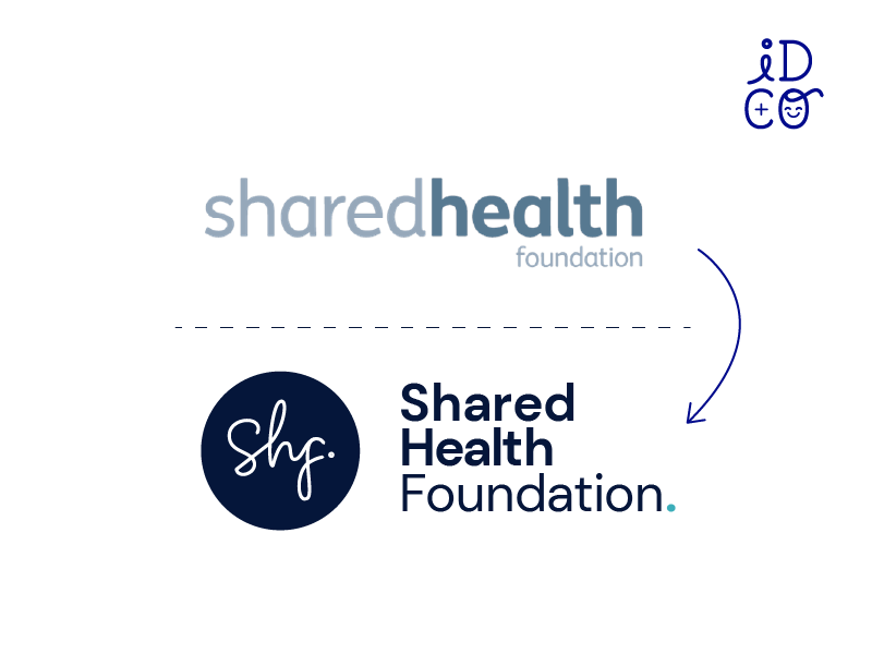
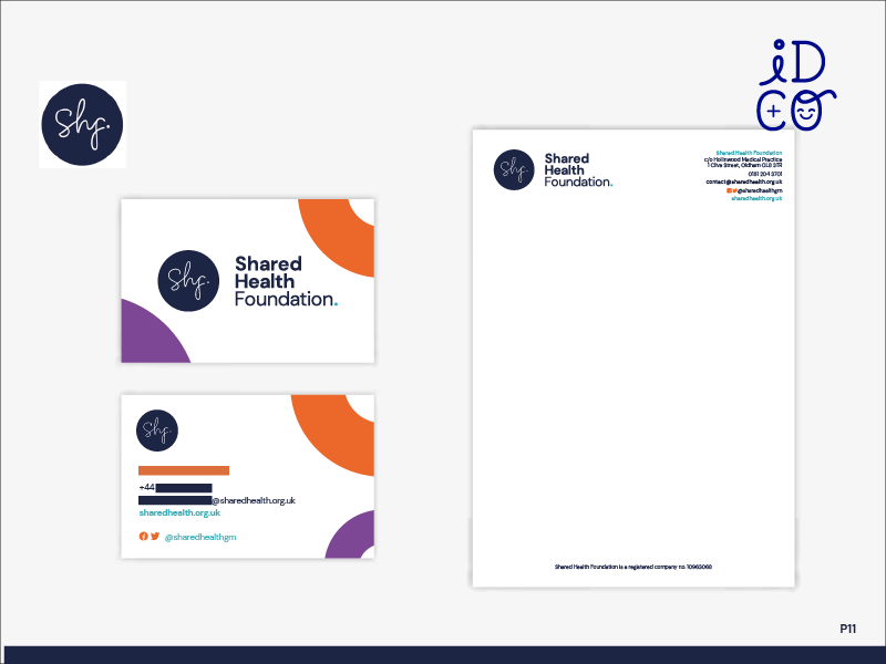
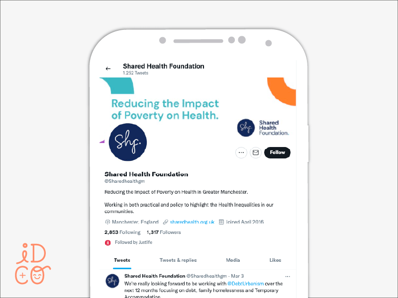
Shared Health Foundation were in need of a new visual identity
It needed to be something that reflected the seriousness of their vision, but also the creativity and innovation which fuels their passion for seeing change in healthcare.

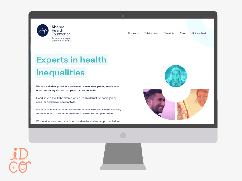
Psst - the website was designed using the brand guidelines developed by ID+Co, and built by Nik @ Flat Cap Creative