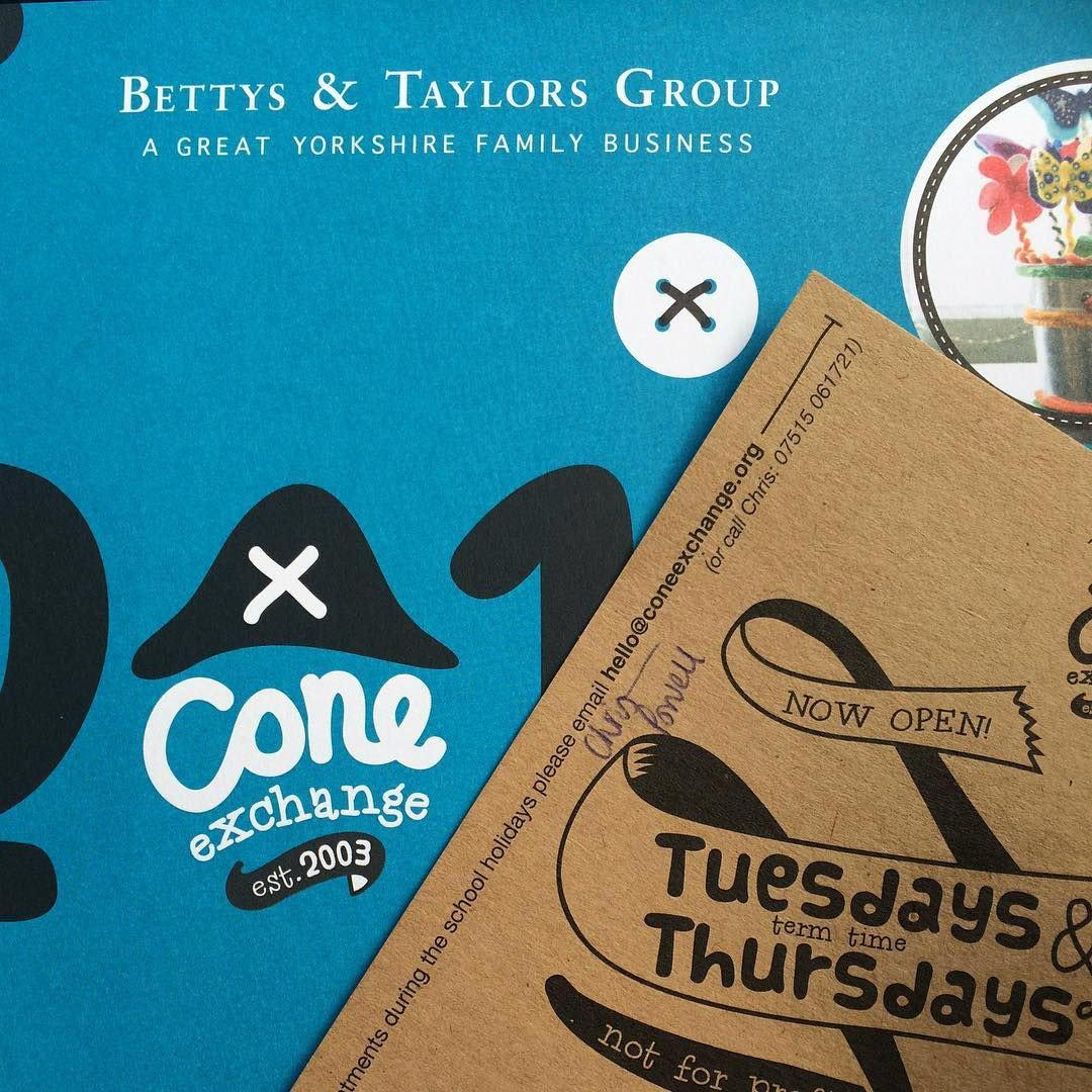

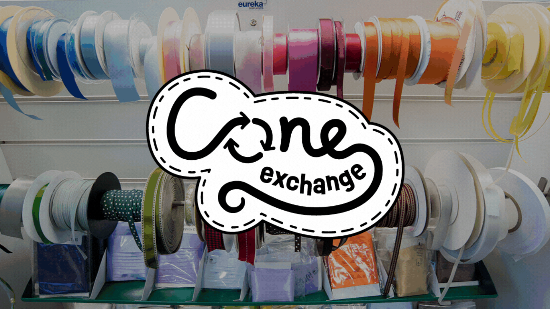
The Cone Exchange is a community project (run by Bettys & Taylors Group) which repurposes manufacturing packaging into something creative and crafty. After 20 years, the logo needed a refresh. The team asked me to take a look and here's what happened!

The previous logo featured a pirate style hat, something they wanted to shift away from but still retaining some recognition and pride in the brand that had grown and was much loved by the community.
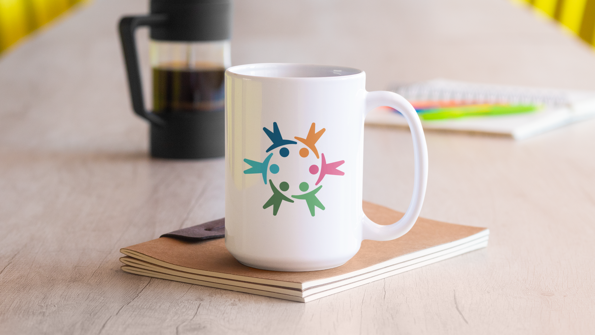
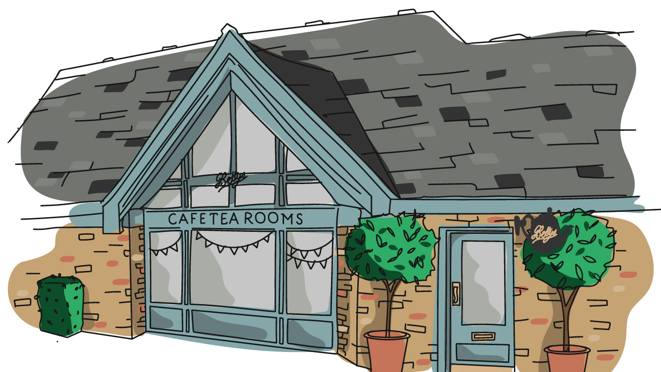
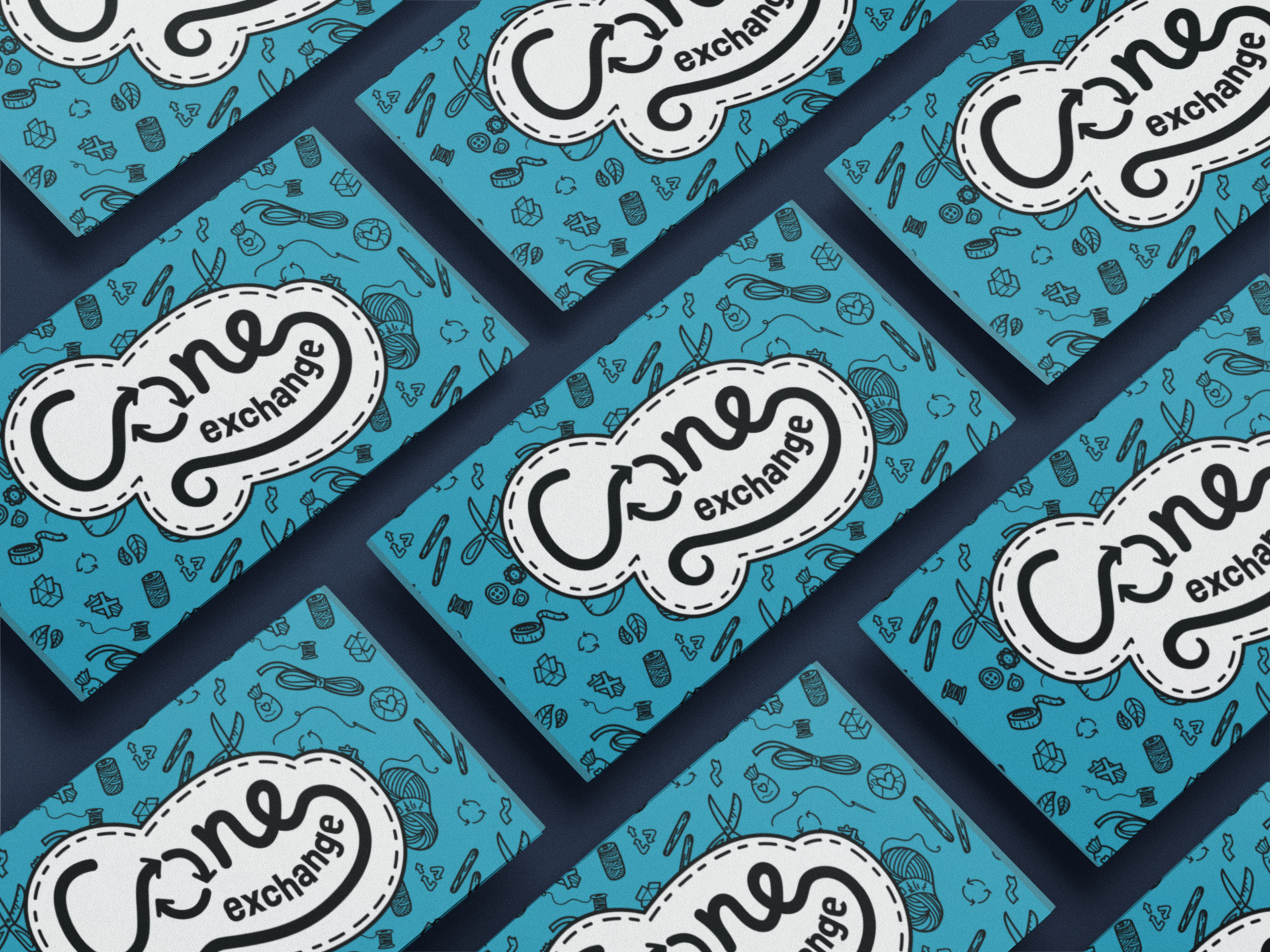
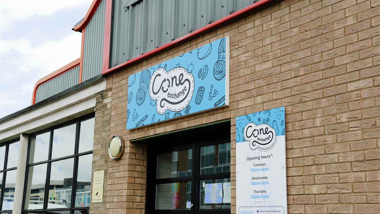
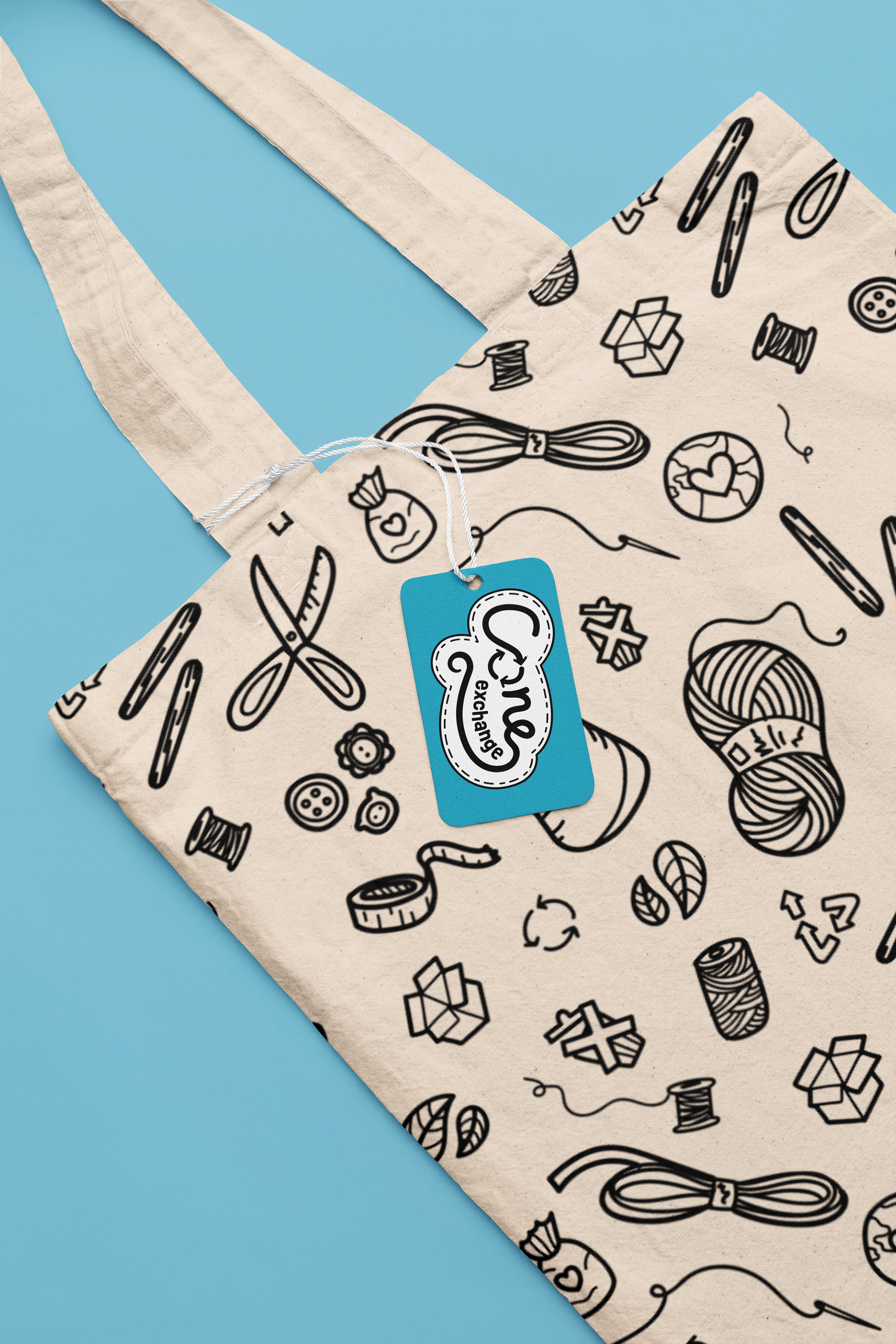
The illustrations, which can also work as a pattern, provided a backdrop and context to support and enrich the branding.